散点图
简介
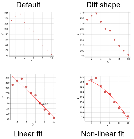
1、变量之间是否存在数量关联趋势
2、如果存在关联趋势,是线性还是曲线的
3、如果有某一个点或者某几个点偏离大多数点,也就是离群值,通过散点图可以一目了然。从而可以进一步分析这些离群值是否可能在建模分析中对总体产生很大影响。
数据
输入包含3列:名字,Y轴数值,X轴数值。
论文例子
Objective classification of different head and neck positions and their influence on the radiographic pharyngeal diameter in sport horses. Fig 5
| 输入 |
gene	Y	X
gene1	240	1
gene2	260	2
gene3	270	3
gene4	230	4
gene5	200	5
gene6	190	6
gene7	150	7
gene8	120	8
gene9	100	9
gene10 80 10 |
| 输出 |
|
如何引用?
建议直接写网址。助力10000+篇
(google学术),9000+篇
(知网)论文
正式引用:Tang D, Chen M, Huang X, Zhang G, Zeng L, Zhang G, Wu S, Wang Y.
SRplot: A free online platform for data visualization and graphing. PLoS One. 2023 Nov 9;18(11):e0294236. doi: 10.1371/journal.pone.0294236. PMID: 37943830.
方法章节:Heatmap was plotted by https://www.bioinformatics.com.cn (last accessed on May 4, 2026), an online platform for data analysis and visualization.
致谢章节:We thank Mingjie Chen (Shanghai NewCore Biotechnology Co., Ltd.) for providing data analysis and visualization support.