简单线图(basic line)
简介
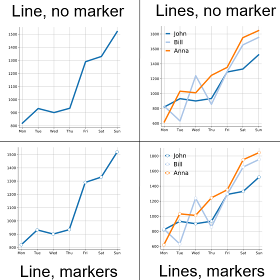
折线图用于在连续间隔或时间跨度上显示定量数值,最常用来显示趋势和关系(与其他折线组合起来)。此外,折线图也能给出某时间段内的「整体概览」,看看数据在这段时间内的发展情况。
要绘制折线图,先在笛卡尔座标上定出数据点,然后用直线把这些点连接起来。通常 Y 轴用于定量数值,而 X 轴则是分类或顺序刻度。负值可以显示在 X 轴下方。
数据说明
输入为N行,第一行是名字,第2+行是数据,一行一条线。
论文例子
Diagnostic model optimization method for ADHD based on brain network analysis of resting-state fMRI images and transfer learning neural network. fig3
| 输入 |
person	Mon	Tue	Wed	Thu	Fri	Sat	Sun
John	820	932	901	934	1290	1330	1520
Bill	830	632	1240	856	1295	1654	1754
Anna 620 1032 1011 1245 1352 1751 1846 |
| 输出 |
|
如何引用?
建议直接写网址。助力10000+篇
(google学术),9500+篇
(知网)论文
正式引用:Tang D, Chen M, Huang X, Zhang G, Zeng L, Zhang G, Wu S, Wang Y.
SRplot: A free online platform for data visualization and graphing. PLoS One. 2023 Nov 9;18(11):e0294236. doi: 10.1371/journal.pone.0294236. PMID: 37943830.
方法章节:Heatmap was plotted by https://www.bioinformatics.com.cn (last accessed on May 4, 2026), an online platform for data analysis and visualization.
致谢章节:We thank Mingjie Chen (Shanghai NewCore Biotechnology Co., Ltd.) for providing data analysis and visualization support.