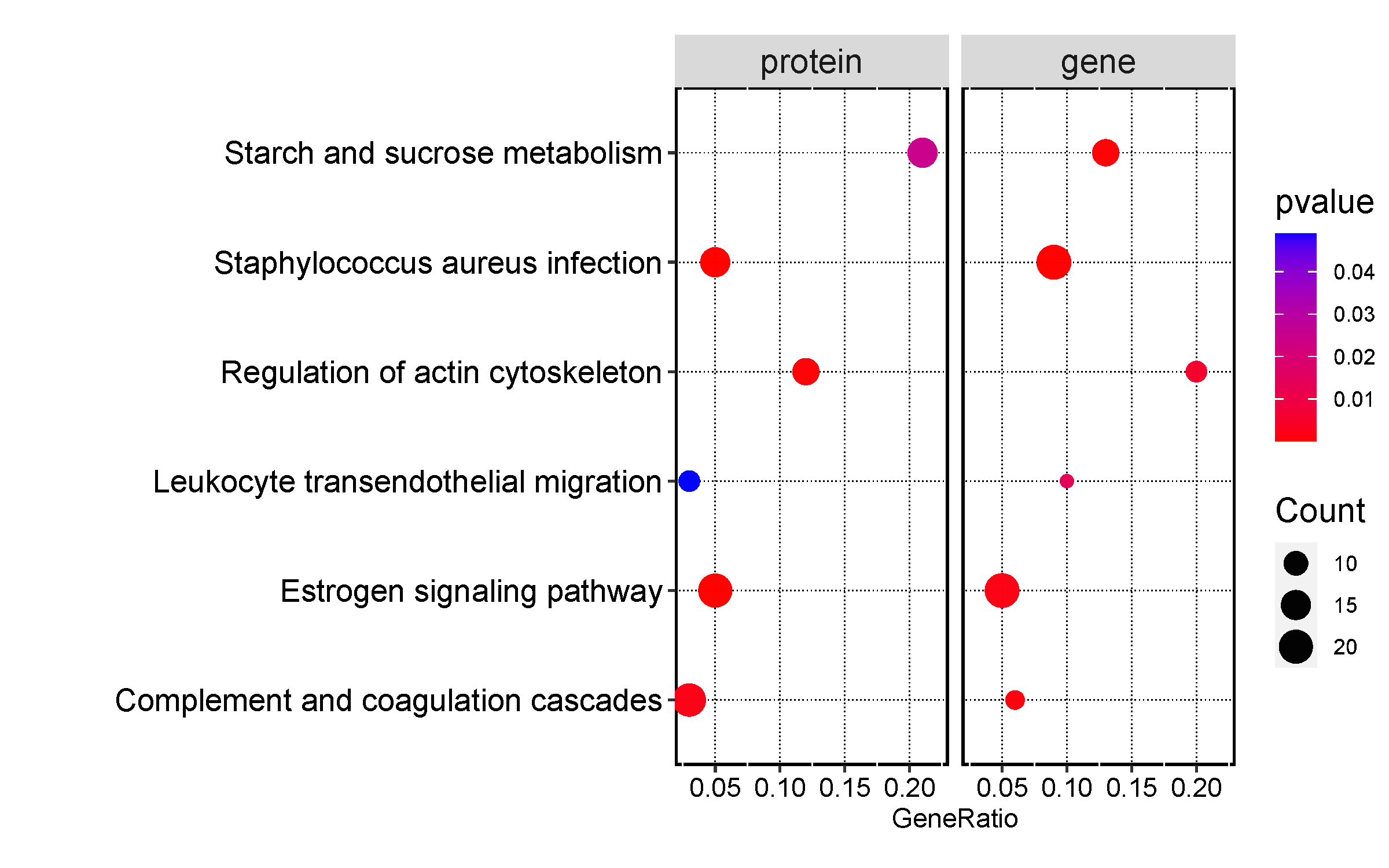
GO,Pathway富集结果气泡图
简介
利用气泡图,将富集结果的p值以颜色表示,基因数用气泡大小表示。如何获得该数据,可以使用在线工具
metascape提交基因,计算富集,得到结果后进行绘图。调用ggplot2 R包
数据说明
输入数据为5列,第一列是富集的名字(Y轴显示内容),第二列是X轴显示内容,例如gene ratio等,第三列是p值(或者fdr,即图中的颜色,根据p值变化),第四列是基因数(气泡大小),第5列为分类或者比较信息,例如protein, gene等。
注意:1,generatio没有的话,可以用fold enrichment等有意义的值代替
2,p列不能为0或者负,若无颜色,使用
p值转化,将log(p)转成p后,重新画图
3,若无点,请调大图片宽度
论文例子
Honghua extract mediated potent inhibition of COVID-19 host cell pathways
论文写作
Dot plot of the KEGG pathway enrichment analysis. The horizontal axis represents the gene ratio, while the vertical axis represents the enriched pathway name. The color
scale indicates different thresholds of the p-value, and the size of the dot indicates the number of genes corresponding to each pathway.
如何引用?
建议直接写网址。助力10000+篇
(google学术),9000+篇
(知网)论文
正式引用:Tang D, Chen M, Huang X, Zhang G, Zeng L, Zhang G, Wu S, Wang Y.
SRplot: A free online platform for data visualization and graphing. PLoS One. 2023 Nov 9;18(11):e0294236. doi: 10.1371/journal.pone.0294236. PMID: 37943830.
方法章节:Heatmap was plotted by https://www.bioinformatics.com.cn (last accessed on May 4, 2026), an online platform for data analysis and visualization.
致谢章节:We thank Mingjie Chen (Shanghai NewCore Biotechnology Co., Ltd.) for providing data analysis and visualization support.