哑铃图(dumbbell chart)
简介
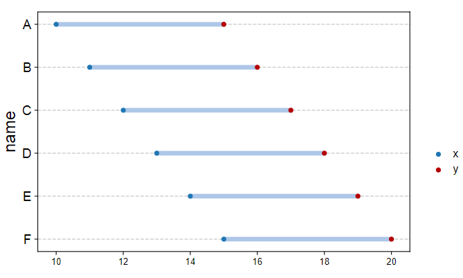
哑铃图类似哑铃,故名,是一种很好的可视化方式,例如表征不同指标的不同组的情况,另外,可以表示某一组受到药物治疗后的变化情况。
数据说明
数据为3列,第1列为名字,第2、3列为数值。根据具体意义选择顺序,一般小的值在第2列,大的值在第3列。可以按照1)第一列的字母顺序排序;2)第2列的大小排序;3)第3列的大小排序;4)第3列和第2列的差值排序,排序后作图,更加美观,甚至能从图中获得更多的额外信息。
论文例子
SLC26A4 correlates with homologous recombination deficiency and patient prognosis in prostate cancer. fig2e
论文写作
Dumbbell chart showing the CNV frequency of HRD-related genes. Red dots meant deletion frequency, and blue dots meant amplification frequency.
如何引用?
建议直接写网址。助力10000+篇
(google学术),9500+篇
(知网)论文
正式引用:Tang D, Chen M, Huang X, Zhang G, Zeng L, Zhang G, Wu S, Wang Y.
SRplot: A free online platform for data visualization and graphing. PLoS One. 2023 Nov 9;18(11):e0294236. doi: 10.1371/journal.pone.0294236. PMID: 37943830.
方法章节:Heatmap was plotted by https://www.bioinformatics.com.cn (last accessed on May 4, 2026), an online platform for data analysis and visualization.
致谢章节:We thank Mingjie Chen (Shanghai NewCore Biotechnology Co., Ltd.) for providing data analysis and visualization support.