GOplot的GO circle图
简介
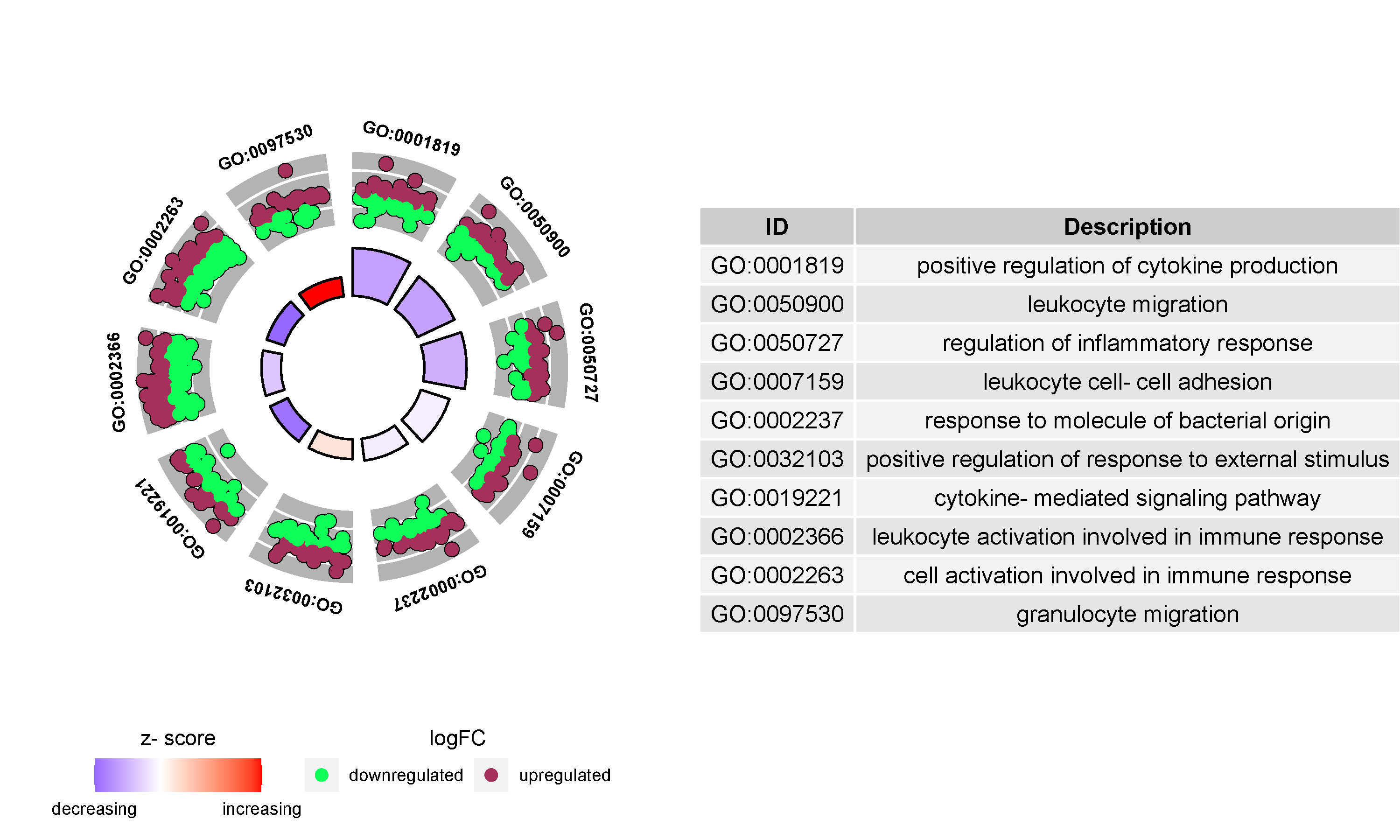
该图使用圆形形式展示富集结果,外圈是名字,中圈为差异情况(up和down),内圈为z-score(不是常规的统计z-score,仅给一个term是更可能降低(负值)或升高(正值)的暗示,计算方法:(up基因数-down基因数)/sqrt(基因数))。参考R包:GOplot
数据说明
输入数据包括2个。第一个是富集结果,包括5列: GOID(只能以GO:开头,后边无所谓),GO term,分类,genes(英文逗号分隔),padj(此列用来定义内圈的高度);第二个是每个基因及基因的log2fc。两个数据必需保持一致(第二个可以输入全部的基因,程序会根据第一个输入的基因自动挑选)。
论文例子
The establishment of a prognostic scoring model based on the new tumor immune microenvironment classification in acute myeloid leukemia. Fig3 C
如何引用?
建议直接写网址。助力10000+篇
(google学术),9000+篇
(知网)论文
正式引用:Tang D, Chen M, Huang X, Zhang G, Zeng L, Zhang G, Wu S, Wang Y.
SRplot: A free online platform for data visualization and graphing. PLoS One. 2023 Nov 9;18(11):e0294236. doi: 10.1371/journal.pone.0294236. PMID: 37943830.
方法章节:Heatmap was plotted by https://www.bioinformatics.com.cn (last accessed on May 4, 2026), an online platform for data analysis and visualization.
致谢章节:We thank Mingjie Chen (Shanghai NewCore Biotechnology Co., Ltd.) for providing data analysis and visualization support.