ROC curve
Introduction
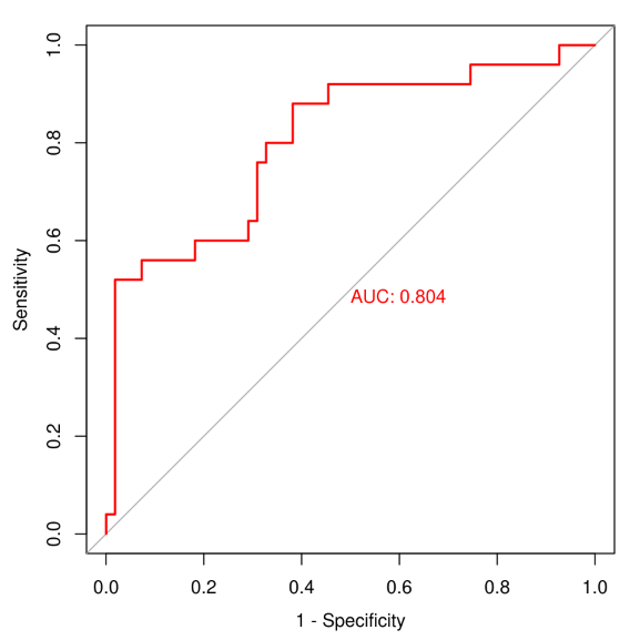
Receiver Operating Characteristic (ROC) curve. The X axis is false positive rate (FPR), Y axis is true positive rate (TPR). For certain classifier, we can get a (TPR, FPR) point pair based on the performance on test sets. Then, by adjusting the thresholds, we can get a curve from (0,0) to (1,1), this is the ROC curve of this classifier. Generally, this curve will be bellow the (0,0) (1,1) diagonal line. Because this diagonal line represents a random classifier. If what your curves are on top of this diagonal line, just exchange your classifier outputs. Although ROC curve is straightforward in representing the performance of the classifier, but we want a value to represent good or bad, that is Area Under roc Curve (AUC). Generally, AUC values are between 0.5-1.0, larger AUC represent better classification performance.
Input data instructions
The first column is sample, the second column is class (binary), the other columns are expression values of certain gene. plot with pROC package.
Paper example
pROC: an open-source package for R and S+ to analyze and compare ROC curves. Fig2
1) How to plot?
1, Put data in excel according to the example format.
2, Copy and paste into input frame.
3, Input pre-checking button to check input
4, After checking pass, select parameters, submit and download
2) How to cite?
9000+ papers in (Google Scholar)
Tang D, Chen M, Huang X, Zhang G, Zeng L, Zhang G, Wu S, Wang Y. SRplot: A free online platform for data visualization and graphing. PLoS One. 2023 Nov 9;18(11):e0294236. doi: 10.1371/journal.pone.0294236. PMID: 37943830.
3) FAQs