test account: test Password: bio123456789
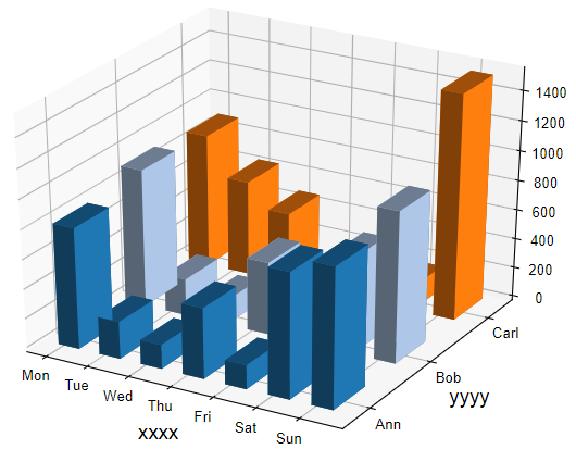
| Input | person Mon Tue Wed Thu Fri Sat Sun Ann 820 254 164 481 164 852 952 Bob 932 248 167 492 254 654 1025 Carl 901 641 481 164 154 164 1520 |
| Output |
|
1) How to plot?
1, Put data in excel according to the example format.
2, Copy and paste into input frame.
3, Input pre-checking button to check input
4, After checking pass, select parameters, submit and download
2) How to cite?
9000+ papers in (Google Scholar)
Tang D, Chen M, Huang X, Zhang G, Zeng L, Zhang G, Wu S, Wang Y. SRplot: A free online platform for data visualization and graphing. PLoS One. 2023 Nov 9;18(11):e0294236. doi: 10.1371/journal.pone.0294236. PMID: 37943830.
3) FAQs