Kaplan Meier (KM) survival curves
Introduction
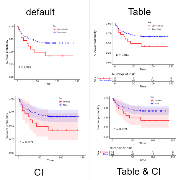
The Kaplan-Meier curve (KM curve) is a commonly used tool in survival analysis, primarily for estimating survival rates over a period of time. By analyzing survival time data, it helps researchers understand the survival probability of individuals or groups at different time points. The KM curve is characterized by its stepwise appearance, with the x-axis representing survival time and the y-axis representing survival rate. A drop in the curve indicates the occurrence of an event (such as death or disease recurrence). The event occurrence cumulative probability curve is the opposite.
The KM curve is applicable for both single and multiple curves. For binary classification, examples include high expression/low expression, male/female, etc. For multi-classification, examples include Stage I, Stage II, Stage III, etc., with a maximum of eight categories allowed. The log-rank method is used by default. The survminer R package is called for plotting.
Input data instructions
1) Input data contain 3 columns: the 1st column is survival time, the 2nd column is status (1 for alive, 2 for death; 0 for alive, 1 for death), the 3rd column is categories.
2) Input data contain 2 columns: the 1st column is survival time, the 2nd column is status (1 for alive, 2 for death; 0 for alive, 1 for death)
Paper example
Chromosomal instability drives metastasis through a cytosolic DNA response. Fig 2e
1) How to plot?
1, Put data in excel according to the example format.
2, Copy and paste into input frame.
3, Input pre-checking button to check input
4, After checking pass, select parameters, submit and download
2) How to cite?
9000+ papers in (Google Scholar)
Tang D, Chen M, Huang X, Zhang G, Zeng L, Zhang G, Wu S, Wang Y. SRplot: A free online platform for data visualization and graphing. PLoS One. 2023 Nov 9;18(11):e0294236. doi: 10.1371/journal.pone.0294236. PMID: 37943830.
3) FAQs