Principal components analysis (PCA)
Introduction
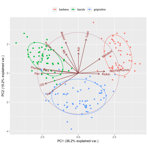
Principal components analysis, PCA. Plotted by ggbiplot
Input data instructions
samples are in columns, features are in rows. The first row is sample names (unique), the second row is group names, other rows are data values.
PC1 and PC2 is the first and the second Principal components (explainary extend of latent variable to the differences). Points represent samples, different colors represent different groups. Ellipses represent 68% confidence intervals of core regions. Arrows represent original variables, the directions of arrows represent correlation between original variable and principle components, lengths represent devotion of original data to principle components.
Paper example
Comprehensive Study of Antibiotics and Antibiotic Resistance Genes in Wastewater and Impacted Mediterranean Water Environments. fig5
1) How to plot?
1, Put data in excel according to the example format.
2, Copy and paste into input frame.
3, Input pre-checking button to check input
4, After checking pass, select parameters, submit and download
2) How to cite?
3000+ papers in (Google Scholar)
Tang D, Chen M, Huang X, Zhang G, Zeng L, Zhang G, Wu S, Wang Y. SRplot: A free online platform for data visualization and graphing. PLoS One. 2023 Nov 9;18(11):e0294236. doi: 10.1371/journal.pone.0294236. PMID: 37943830.
3) FAQs