Read before use
1, check data with precheck (windows version) tools
2, data from excel, copy and paste data into the input frame
3, data from txt, must tab-seperated, copy and paste data into the input frame
4, specieal and non-English characters such as #, <, >, %, (, ), α are not friendly
5, use point as decimal separator, not comma. e.g. 3.14, not 3,14 as pi
Required

Optional
Figure size
figrue width:
figure height:

Fontsize
Axis ticks fontsize:
Axis Label fontsize:
Legend fontsize:

Y range (defult if left blank)
Ymin:
Ymax:

Others
X ticks rotation:
marker size:
marker edge color:

Marker shape
1)
2)
3)
4)
5)
6)

Colors (at most 6 lines)
color 1:
color 2:
color 3:
color 4:
color 5:
color 6:

Fontfamily


errorbar

Instruction
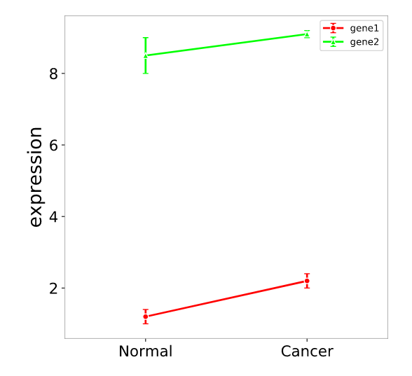
Error bar plots display the mean and standard deviation of each group of data. The standard deviation reflects the dispersion of data points, used to show the variability range of the data and compare differences between groups.
Input data
The data includes 3 columns: the first column is the line identifier (indicating how many lines to plot), the second column is the X-axis label, and the third column is the numerical value.
Paper example
Natural variation in OsMYB8 confers diurnal floret opening time divergence between indica and japonica subspecies Fig 1 i
Input Example
Output

1) How to plot?
1, Put data in excel according to the example format.
2, Copy and paste into input frame.
3, Input pre-checking button to check input
4, After checking pass, select parameters, submit and download

2) How to cite?
3000+ papers in (Google Scholar)
Tang D, Chen M, Huang X, Zhang G, Zeng L, Zhang G, Wu S, Wang Y. SRplot: A free online platform for data visualization and graphing. PLoS One. 2023 Nov 9;18(11):e0294236. doi: 10.1371/journal.pone.0294236. PMID: 37943830.

3) FAQs