butterfly bar plot
Introduction
Display data with left and right bars, similar to a butterfly, hence the name.
Input data instructions
Input data contain 3 columns: the first column is names, the second column is left value, and the third column is right value (all value must be positive).
Paper example
Automated diagnosis of COVID-19 using radiological modalities and Artificial Intelligence functionalities: A retrospective study based on chest HRCT database. Fig. 3D
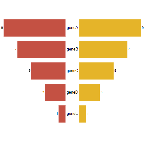
| Input |
name	left	right
geneA	9	9
geneB	7	7
geneC	5	5
geneD	3	3
geneE 1 1 |
| Output |
|
如何引用?
建议直接写网址。助力10000+篇
(google学术),8500+篇
(知网)论文
正式引用:Tang D, Chen M, Huang X, Zhang G, Zeng L, Zhang G, Wu S, Wang Y.
SRplot: A free online platform for data visualization and graphing. PLoS One. 2023 Nov 9;18(11):e0294236. doi: 10.1371/journal.pone.0294236. PMID: 37943830.
方法章节:Heatmap was plotted by https://www.bioinformatics.com.cn (last accessed on May 4, 2026), an online platform for data analysis and visualization.
致谢章节:We thank Mingjie Chen (Shanghai NewCore Biotechnology Co., Ltd.) for providing data analysis and visualization support.