Principal components analysis (PCA)
Introduction
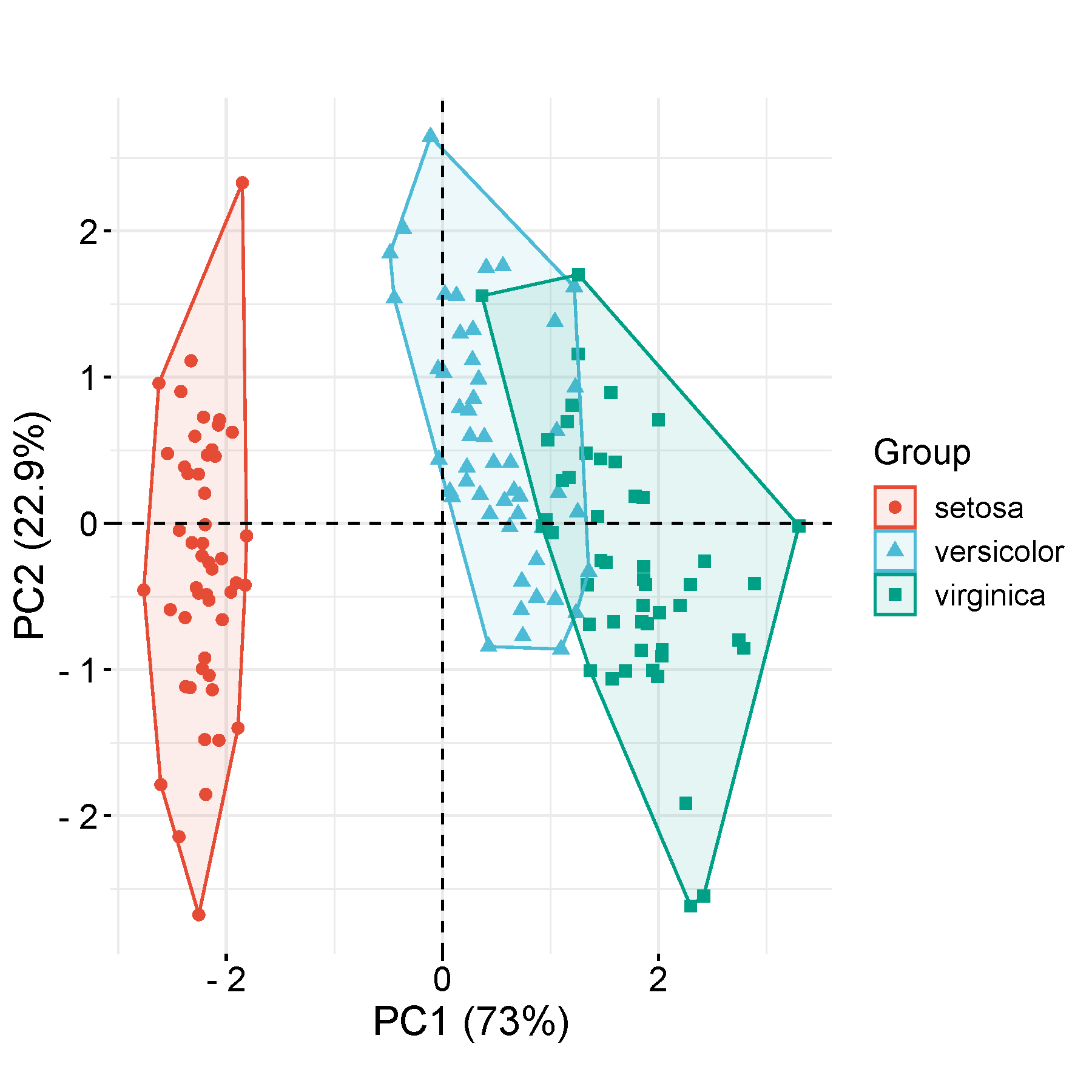
PCA is a dimensionality-reduction method that is often used to reduce the dimensionality of large data sets, by transforming a large set of variables into a smaller one that still contains most of the information in the large set. fviz_pca_ind, ellipse.level=0.95
Input data instructions
Features (e.g. genes) in rows, Sample in columns. The first row is sample names, the second row is group names (not pure integers), and the other rows are values. PC1, PC2 in the output figure are the first, and the second principal components (degree of explainary of latent variables to differences). ref: prcomp for PCA calculation, FactoMineR R package for plotting
center and scale by default.
Paper example
[Nature communications] Sympathetic axonal sprouting induces changes in macrophage populations and protects against pancreatic cancer. Fig4h
1) How to plot?
1, Put data in excel according to the example format.
2, Copy and paste into input frame.
3, Input pre-checking button to check input
4, After checking pass, select parameters, submit and download
2) How to cite?
9000+ papers in (Google Scholar)
Tang D, Chen M, Huang X, Zhang G, Zeng L, Zhang G, Wu S, Wang Y. SRplot: A free online platform for data visualization and graphing. PLoS One. 2023 Nov 9;18(11):e0294236. doi: 10.1371/journal.pone.0294236. PMID: 37943830.
3) FAQs