GO,KEGG富集点线图
简介
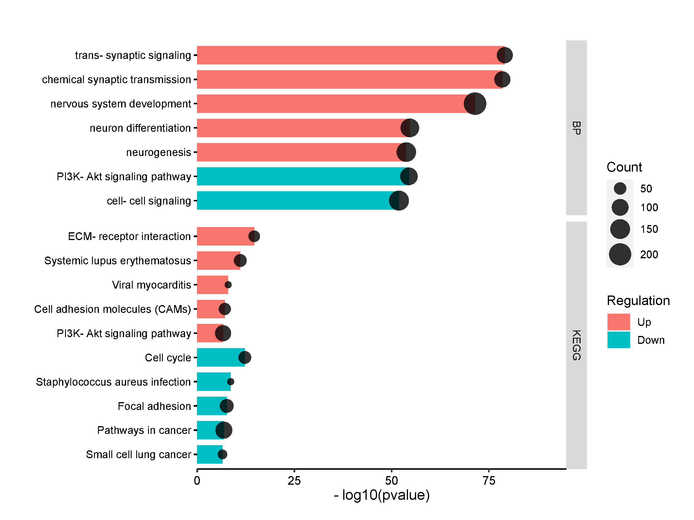
GO,KEGG富集结果条形图加点构成。其中条形表示p值大小,条越长,表示p值越小;点表示基因数,点越大,表示基因数越多。该图可以绘制多个分类:1,仅GO结果,即BP,CC,MF三种;2,BP,KEGG;3,BP,CC,MF,KEGG
数据说明
第一列是Term名;第二列是Category分类;第三列是Count;第四列为Pvalue(程序会自动进行-log10转化);第五列是Regulation(Up或者Down,其中Up表示上调基因的富集结果,Down表示下调基因的富集结果)。
论文例子
Hepatic transcriptome perturbations in dairy cows fed different forage resources. Fig3
写作参考
Significantly enriched Gene Ontology Biological Process and KEGG pathways revealed by ClusterProfiler analysis of the genes up- (in red shade in the figure) or down- (in blue shade in the figure) regulated in treatment samples compared to control samples. In vertical axis is the terms, in horizonal axis is the -log10(pvalue).
如何引用?
建议直接写网址。助力10000+篇
(google学术),9000+篇
(知网)论文
正式引用:Tang D, Chen M, Huang X, Zhang G, Zeng L, Zhang G, Wu S, Wang Y.
SRplot: A free online platform for data visualization and graphing. PLoS One. 2023 Nov 9;18(11):e0294236. doi: 10.1371/journal.pone.0294236. PMID: 37943830.
方法章节:Heatmap was plotted by https://www.bioinformatics.com.cn (last accessed on May 4, 2026), an online platform for data analysis and visualization.
致谢章节:We thank Mingjie Chen (Shanghai NewCore Biotechnology Co., Ltd.) for providing data analysis and visualization support.